Tiger Gold
PANTONE 1235 C
HEX#EAB337
RGB234, 179, 55
CMYK0, 32, 96, 0
Our colors go beyond a logo or a team’s uniform. They stand out amongst the crowd, and they connect us to where we come from and who we are.
All institutional communications (email banners, letterhead, newsletters, templates, forms, webpages, invitations, etc.), both internal and external, require use of the primary colors to ensure easy identification of CC collateral.
CC’s secondary color palette draws directly from the natural environment that shapes our sense of place. These hues were inspired by the landscapes surrounding our campus: the red rock formations of the Garden of the Gods, the evergreen forests on Pikes Peak, the sandstone architecture that anchors our grounds, and the vivid skies that frame a bluebird day in the Rockies.
These should only be used for marketing campaigns and promotional materials for students and external audiences like prospective students, parents and families, and alumni. The primary palette should dominate the materials, especially in high-profile areas like covers for brochures, booklets, etc. However, the secondary palette can play a large role in those materials as a more robust palette is needed for campaigns and other large-scale initiatives.
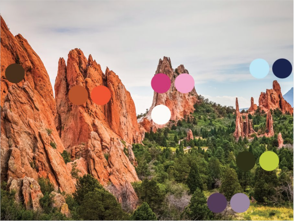
Our secondary color palette was inspired by the beautiful scenery of Colorado.
Consistent use of CC’s primary colors will build recognition and equity. If the secondary colors are predominantly used on a design, that weakens the brand equity. When creating materials for the College, follow the two-thirds/one-third rule. The primary colors should be used on two-thirds of the design. Secondary colors should only be applied in one-third of the design.